EXPLANT OR BUST- SUPPORTING EDUCATION
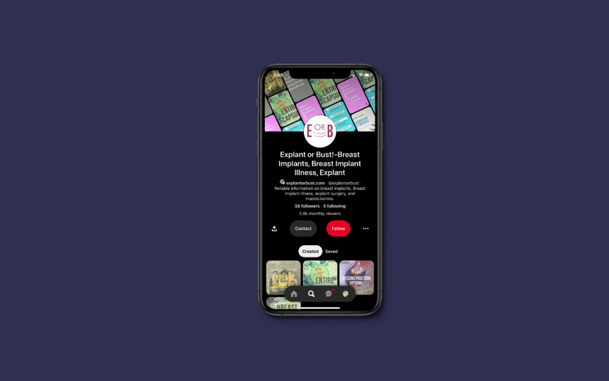
My client had a personal history with breast implant illness (BII) and was passionate about creating a platform to address health concerns. She approached me to develop a visual foundation for her blog, "Explant or Bust".
Her blog aimed to provide information and support for those who have experienced similar health issues related to breast implants. Her vision was to create a platform that portrayed a sense of urgency with passion and determination.
In my research of other medical blogs, I noticed that many of them had similar color palettes, consisting of calm blues and whites. To make "Explant or Bust" stand out, I chose a color palette that would be familiar to Sarah's target audience but also distinct to her platform.
The logo I designed incorporated capitalized letters and crescent shapes, symbolizing the scars women receive while recovering from explant surgery. This design element added a sense of urgency and conveyed the seriousness of the health concerns Sarah's blog aimed to address.
PROJECT TYPE
Brand Identity Design
ROLE
Graphic Designer
Adobe Illustrator
TOOLS USED
YEAR
2019
COPIED RIGHT
Visual identity and promotional materials for the thesis defense and end-of-year gallery showcase.


